

Plan It
Plan It
Planit is an event attendance tool that is designed to improve user experience when it comes to planning events in a group by offering features to help do so.
It is meant to be an all-in-one solution to it’s competitors and boost attendance rate, giving the users maximum ease throughout the whole booking process.
Duration
16 weeks
Role
Student Designer
Design Program
Figma
Introduction
Problem
There is a large population of people that attend events, whether it may be concerts, live events, comedy shows, sporting events, the list goes on. Although many attend these events solo, the majority attend in groups. Now, the issue arises when we take a close look at all the platforms used to purchase tickets to attend these events…there is a lack of group supporting features to make the checkout process that much easier and reliable. Reliability is in question because no matter the event, there is always a large rate of dropouts and loss in potential sales due to the user either losing their spot in line or seat because they took longer to coordinate with their friends, or simply from the frustration of deciding what and where to attend. As the saying goes, there is always paralysis through analysis. This product is meant to ease the burden on users who stress over planning an event with a group, or just have a hard time with coordination.
Lack of user support when planning group events.
Many users drop out of the buying process.
Users often lose their spot in line when waiting for their friends to get back to them once the timer gets to 0.
These all lead to loss in potential sales.
“While it is useful for some people to be able to select their exact seat, requiring this of every user gives a reason to drop-out while they ask their friend for an opinion. Frustrated users always lead to high abandonment rates. Eventbrite reports an average 70% abandonment rate for ticket purchases and that’s certainly not a surprise. So how can we build a ticket purchasing journey that is a breeze.”
- Mat Hayward, Founder and Partnership Director of Kind.
Solution
Coming up with a design that, first and foremost, is inviting with a calm vibe to it is the basis to feel inviting to users. Next there will be two key features that make this product stand out from competitors and help solve the problem at hand. The first feature is a poll that allows users to add events to a list and invite others who will be attending to vote on which one they will go to. This alleviates pressure on coordination and indecisiveness. The second feature is a split-payment to enable users to split the cost of an event amongst their group as soon as the purchase is being made, speeding up the entire checkout process and reducing dropout rates. This is done because it encourages there to be a designated user to finalize the purchase and makes picking the seats together quicker and done on one person’s time rather than a couple.
Research
Conducting user and secondary research is a vital part of coming up with a solution that users need. I conducted research to defend my hypothesis on a solution for the problem that was brought to light.
Competitive Analysis
Here I performed secondary research by inspecting existing applications and looking for what may be missing or what is included in one but not the other competitors.
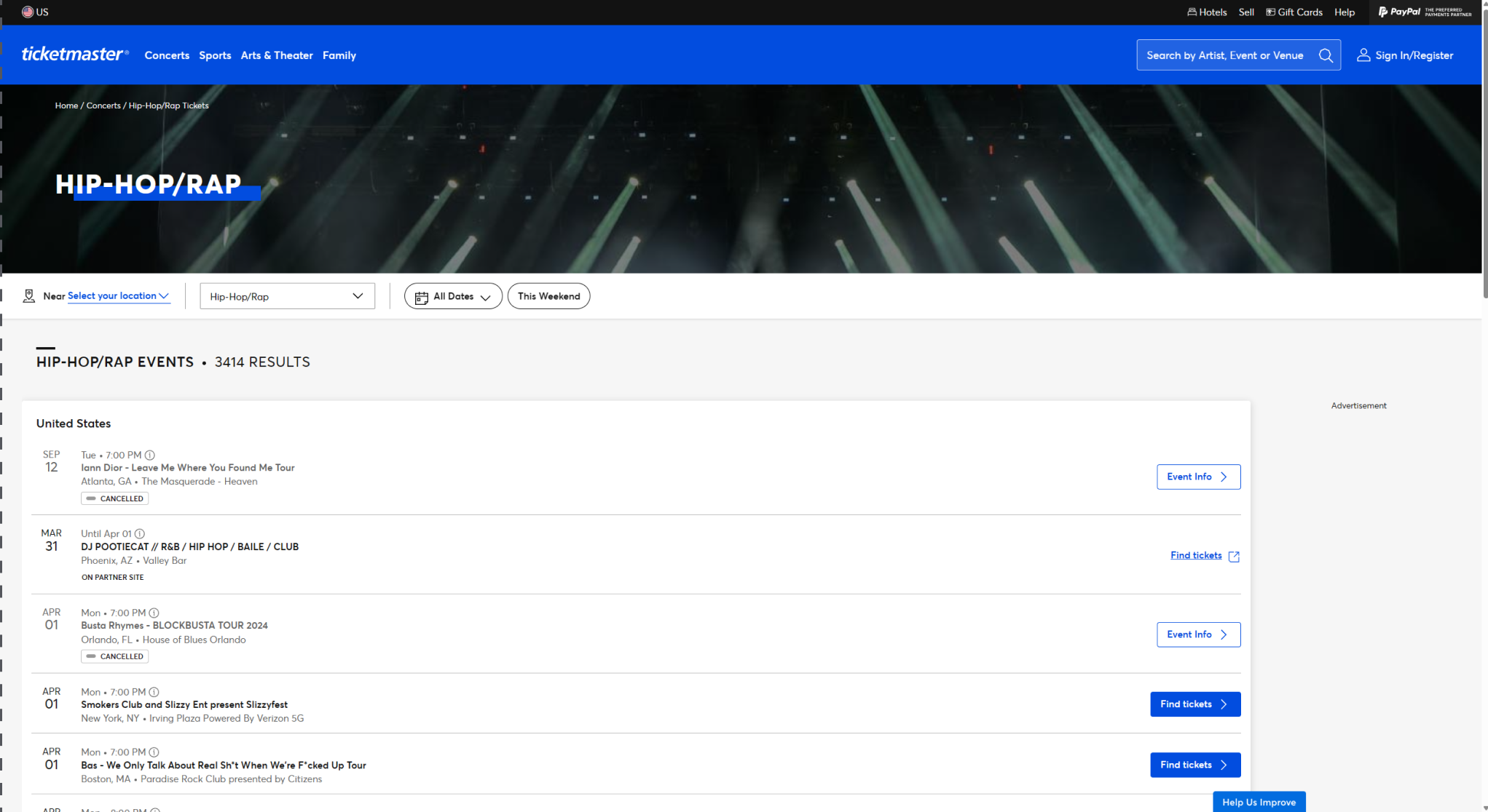
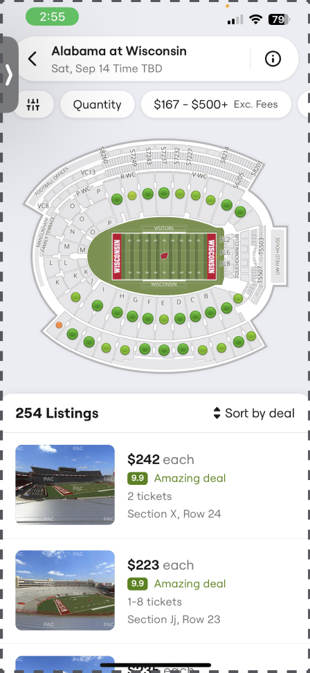
Ticketmaster
Largest ticketing platform, allowing users to view more reviews of events and receive more feedback.
Most supported of the bunch, allowing for the most support.
Doesn’t navigate with adblock active.
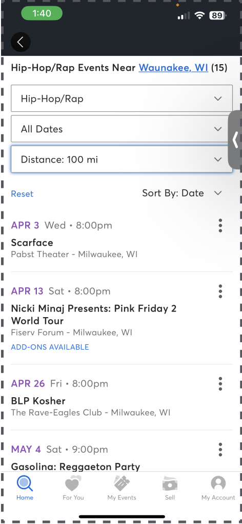
Seat Geek
Search while moving map.
Service fees.
Very small UI on mobile.
Stubhub
Cleanest UI.
Multi-option hero image.
Only English.
Vividseats
Most simple UI.
Allows various currencies.
Only dark themed mobile UI.
Least popular.
Affinity Mapping
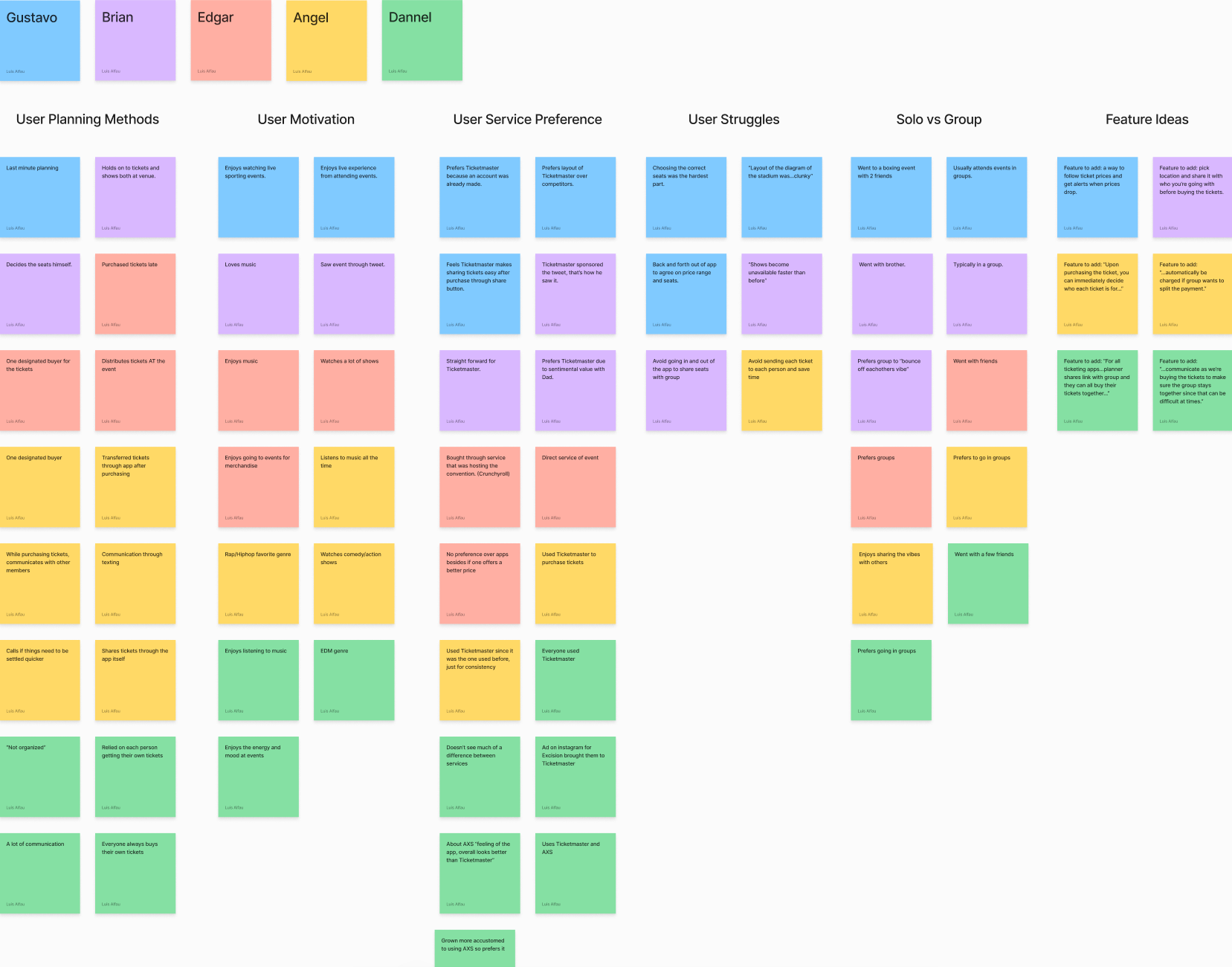
Key Insights
Users expressed the need of group support when planning an event because it doesn’t exist in any popular ticket apps.
Many lose their spot in line or seats for being stuck on confirming seats with their friends.
A quicker checkout process is desirable in some form of an extra feature.
User Interviews
User interviews were conducted to receive insight on people’s pain points and needs when it comes to this environment of product.
4 participants were interviewed to help generate a hypothesis based on findings.
It was done remotely and recorded with their permission.
Same set of questions were asked to the participants.
Feedback was given in the end along with their idea for a feature.
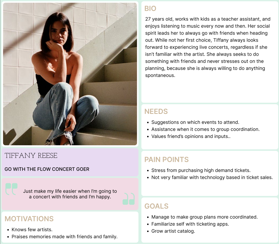
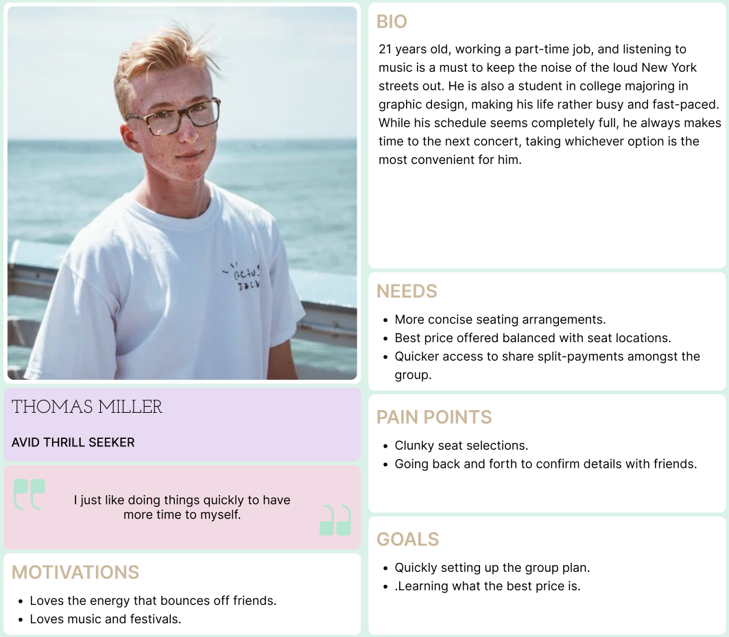
Personas
As a result of the user research conducted, these two personas were created to highlight the key pain points of the users along with other factors. They represent the target users to help summarize key insights and to come up with a solution for their problems.
Two personas, different needs, different pain points, different motivations, but the same interest in attending events.
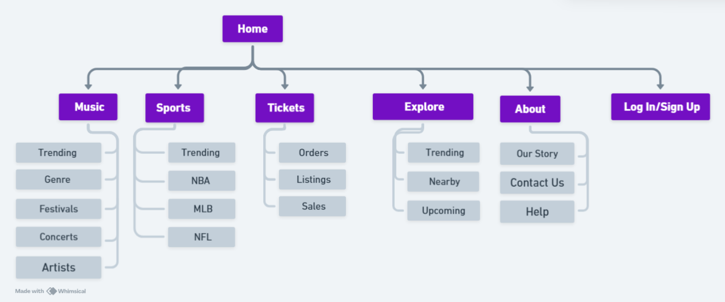
Sitemap
Similar to competitors, the sitemap is organized in a way for users to have the least amount of trouble navigating to their desired destination.
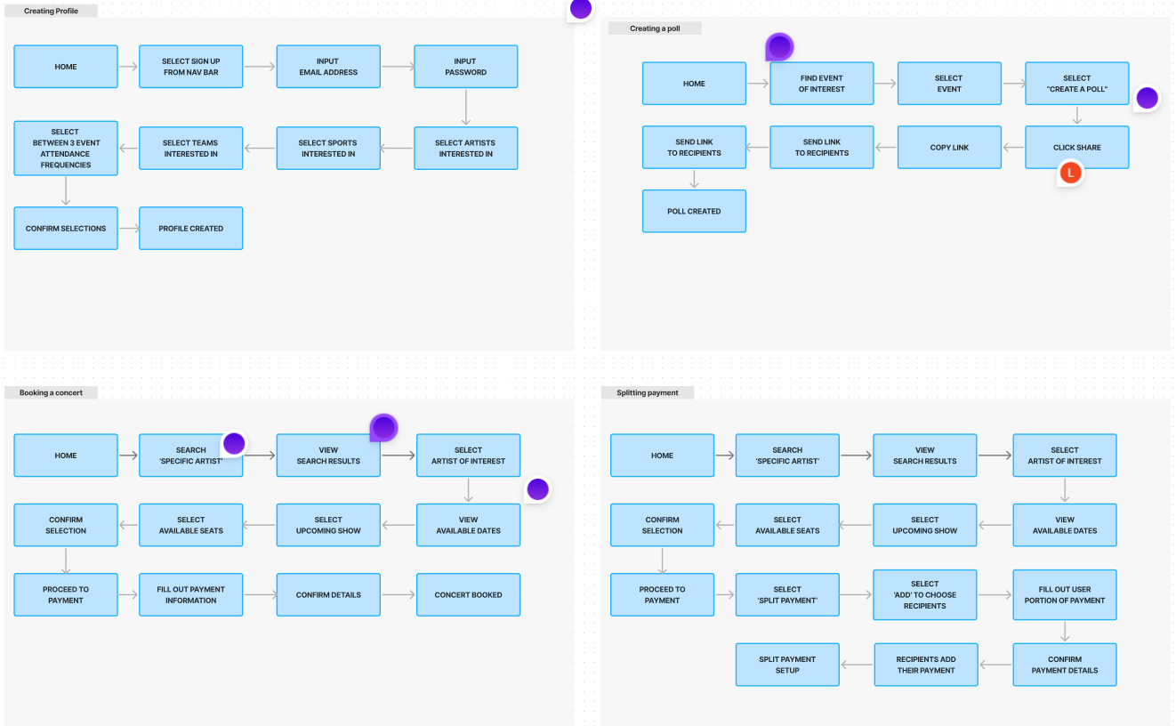
Core Tasks
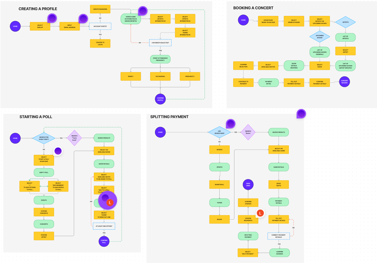
Task Flow
Here we have the website’s task flow for the user to complete core tasks. It was designed to be intuitive and easy to navigate. The user first thinks of what their goal is, then follow through the carefully structured pages to get there.
Creating a profile.
Creating a poll.
Setting a split payment up.
Booking an concert.
User Flow
We see various actions the user takes to complete the core task. Different outcomes are accounted for, whether the user decides to point and click the nav bar options, or if they rather use the search bar and type in what they are looking for.
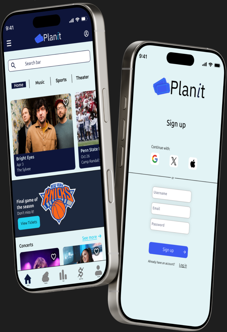
Design
With the research done up to this point, I understood what users are expecting to see and what is missing from competitors, along with some patterns that would be beneficial to keep. Users want something that is reliable, secure, familiar and inviting, so I began creating wireframes based off these insights.
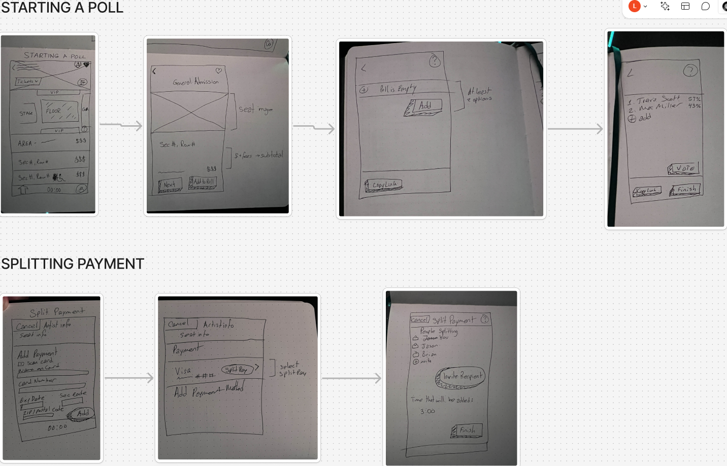
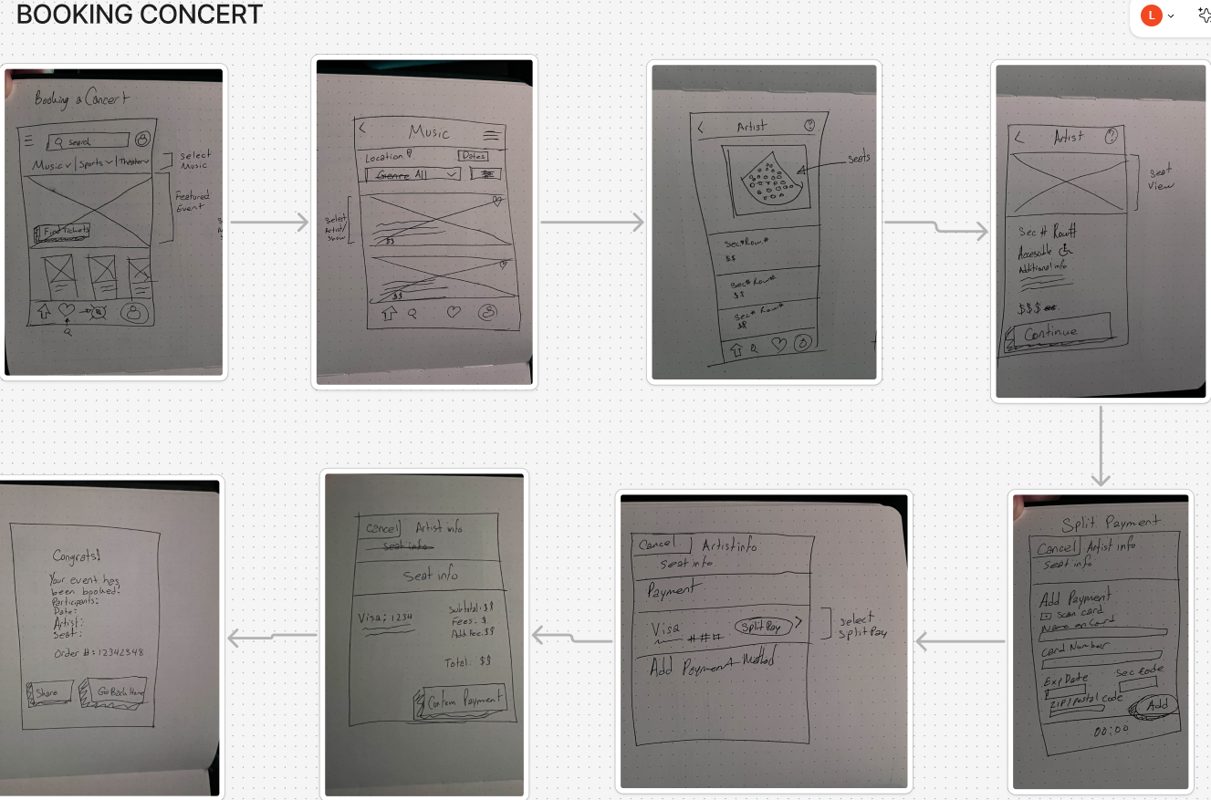
Low-fidelity Wireframe
Mid-fidelity Wireframe
I digitized the lo-fi wireframe and added some more details, like CTAs, to bring the design more to life and give a clearer picture of what it is expected to look like. Added place holders for cards, images, and banners. Showed only the essential screens here to not go too far into details until the hi-fi wireframe. Kept the design familiar yet added new paths users haven’t expected to see from competitors.
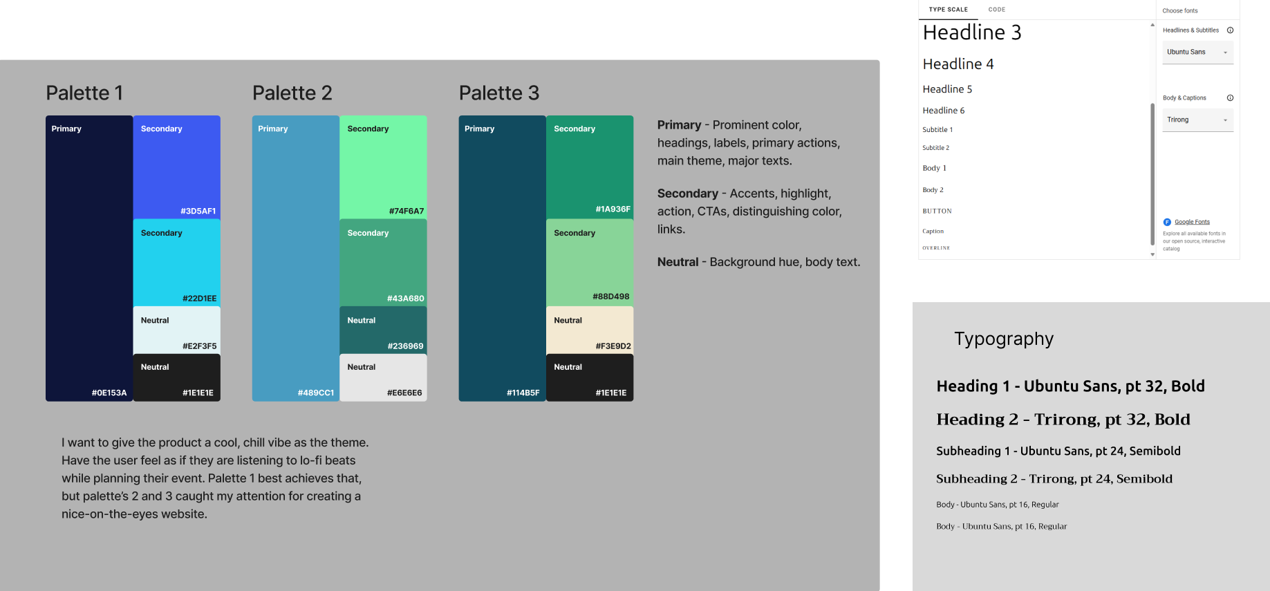
Style Tile
Going with a comforting, friendly look to make the product feel inviting was the goal here. I wanted to have the user feel a calming sensation while navigating through the product since purchasing tickets can sometimes be a stressful thing to do, especially when it’s for a group.
Examples of screens with style applied:
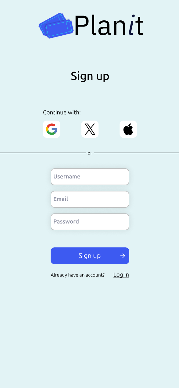
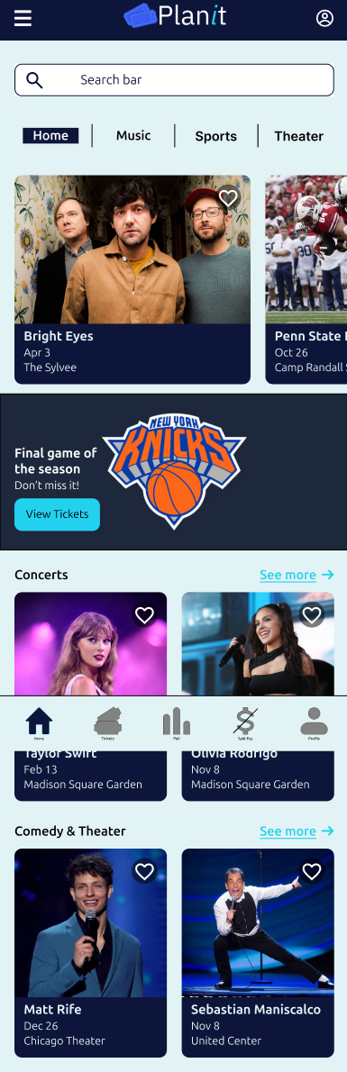
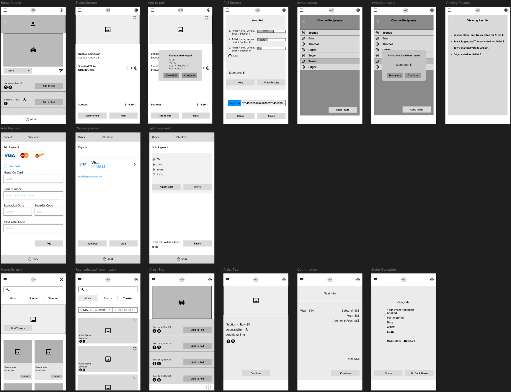
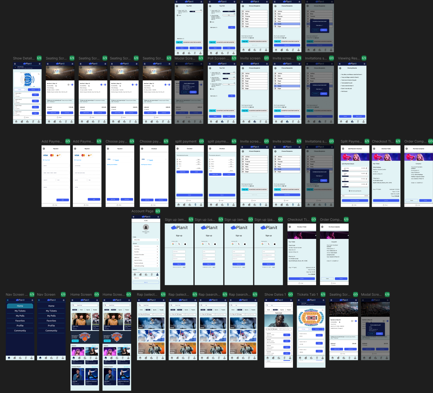
High-Fidelity Wireframe
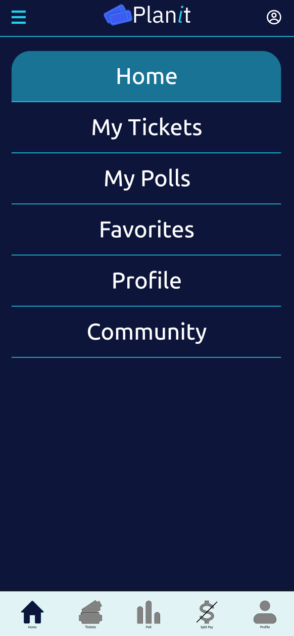
Moving towards the final design by integrating the chosen styling. Here we see what the user can expect to see with navigating through the product. This will be used as the foundation for prototyping.

Key Features on Display
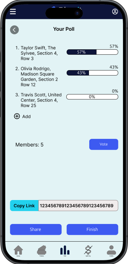
Create a Poll
Another key feature that allows users to invite a group of friends and invite them to vote on a list of events to attend.
Users can view the results live so that they can come to a decision.
There are updates on the participants who joined and voted.
A ‘link’ is provided for those who aren’t signed up on the app yet.
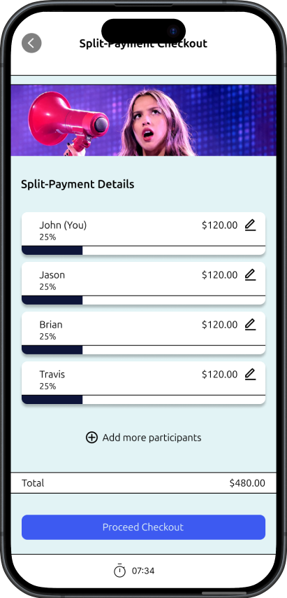
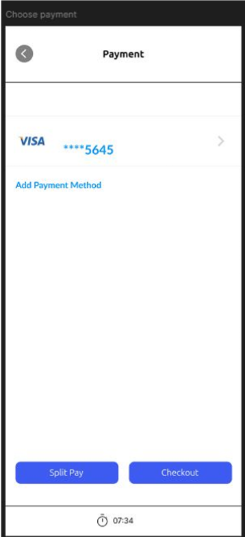
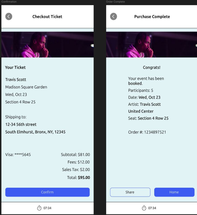
Split-Payment Checkout
Feature that allows users to split the bill amongst their group of friends who are attending the same event.
Usability Testing
In general, the users found the tasks needed to be completed rather straightforward and did not have trouble navigating to the end. The design gave a sense of familiarity, and the users found no trouble choosing the element to navigate to their desired destination, based on the tasks given to them. It was overall well-received, besides one user asking about the purpose of the poll feature but understood right after a brief explanation. There are, however, specific areas that can use improvements/changes that can help with the overall experience and reduce the chances for errors.
Usability Testing Analysis
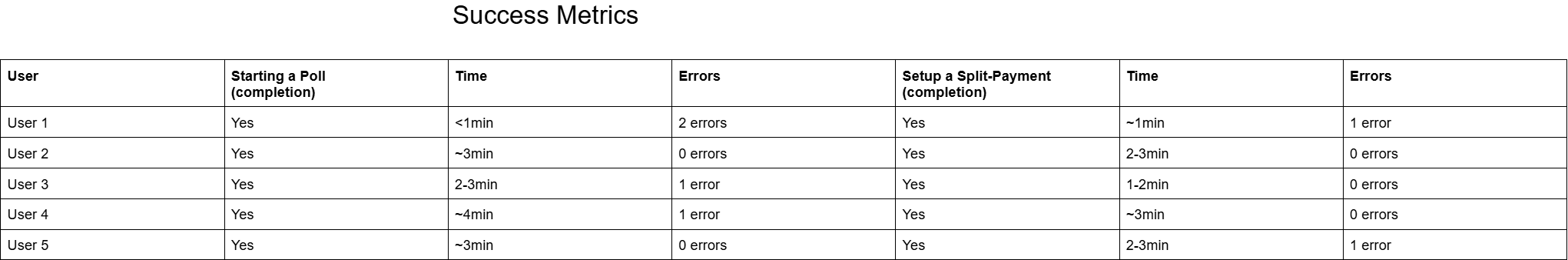
All the tasks given to each of the users were completed relatively quickly with minor errors. 3 out of 5 of the users clicked the wrong button for the expected navigation of the task that was asked of them, taking them elsewhere, creating just a bit of confusion. These results were somewhat expected as it was still a new environment for the users, although familiar., but can be worked out to prevent it to future new users, which is partly what I took away from this test. Aside from that, the users quickly got back on track and were able to finish without any further errors.
How will these features be refined?
Giving the users more control over the price management of split-payment.
Giving presets of percentages for split-payment.
Have the poll results screen show more details.
Priority Revisions
“add” button in payment selection screen was confusing on whether it was to add another payment method or continue to the next screen.
Checkout screen felt like a “powerpoint presentation” and had too much white-space.
Before
Reduced white-space.
Removed tacky text background.
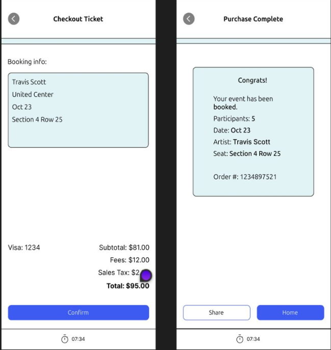
Added more details to the ticket being purchased.
Changed the bottom right button from “add” to “checkout to reduce confusion from users.
After
Final Design
Project results and what follows…
Planit has successfully addressed the problems that were brought up from users and shows promise for growth.
User Experience
Conclusion
Users were empathized with and their problems were heard in teh creation of this product.
Users tested and gave feedback to the product and were ultimately pleased with what was presented.
User satisfaction was measured highly.
What comes next?
We will continue to refine and improve the product to reach user ultimate satisfaction and remain a long term solution from other services.
Brand trust will continue to be built to boost traffic and sales.