

RoamMate
RoamMate

A co-living travel app designed to help solo travelers find affordable shared spaces and the connections that make the journey worthwhile.
Duration
3 Months
Role
End-to-End UX/UI Designer
Platform
iOS/Android Mobile App
01
IntroductionSolo travel shouldn't mean traveling alone.
Solo travel has grown dramatically in recent years, yet the platforms designed to support it have barely caught up. Airbnb and Expedia offer lodging, but no community. Coliving.com requires a month-long commitment. There's no mainstream product that helps solo travelers find affordable, short-term shared accommodation and connect with the people they'll be sharing it with.
"People sometimes opt out of traveling somewhere because of the initial costs of places to stay, or are afraid to travel alone to foreign countries."
RoamMate was designed to close that gap, a platform where solo travelers can book co-living spaces, learn about potential co-inhabitants before arriving, and build genuine connections with people who share the same passion for exploration.
The project was completed as a Capstone end-to-end design project, and I served as the sole UX/UI designer across every phase from initial research through high-fidelity prototype and usability testing.
3
core problem statements identified from research, each inspiring a design direction
100%
usability test task completion rate across both rounds of testing
5
usability test participants with real solo travel experience
4
prioritized design iterations made after final testing round
02
ResearchListening before designing.
Method: User Interviews
Remote, moderated sessions with participants who had prior solo travel experience
Questions explored booking habits, shared living experiences, and motivations for travel
Participants also spoke to remote work needs when traveling
Sessions surfaced both emotional and practical pain points around co-living
Competitive Landscape
Airbnb: popular but doesn't show guest profiles, limited trust signals
Expedia: no community aspect, purely transactional
Coliving.com: requires 1-month minimum, not viable for short-term travel
Couchsurfing: community-focused but lacks affordability structure
Gap identified: no platform targets short-term co-living with guest discovery
What Users Wanted
Visibility into co-inhabitants before committing to a booking
Affordable options that don't sacrifice authenticity or location
A reliable internet environment for remote workers
Connections that could organically turn into travel companions
Key Frustrations Surfaced
Visibility into co-inhabitants before committing to a booking
Affordable options that don't sacrifice authenticity or location
A reliable internet environment for remote workers
Connections that could organically turn into travel companions
The Central Insight
Users weren't just looking for somewhere cheap to sleep — they wanted context, connection, and confidence. The right platform could normalize solo travel by reducing the unknowns that make it feel risky.
Trust & Transparency
Affordability
Cultural Immersion
Remote Work Compatible
Community Discovery
03
DefineFrom Insights to a Design Direction.
With research complete, I synthesized findings into a primary persona and three "How Might We" problem statements that would govern every design decision going forward. I took a largely iterative approach, designing, testing, and refining in cycles, rather than locking in decisions early.
The persona, Rachel Rey, a 23-year-old artist from Texas, embodied the target user perfectly: extroverted and spontaneous, deeply motivated by new experiences and human connection, but frustrated by the affordability and trust issues that kept getting in her way.
"How might we make staying in the house a better experience for users with a desire to bond with other travelers?"
"How might we speed up the booking process by reducing the time users spend looking for their perfect house to rent?"
"How might we make the product feel centered around solo travel, pushing for it to feel mainstream?"
Deliverables at this stage
User Persona
Sitemap
Problem Statements
Rachel Ray - Primary PersonaUser Flows
Task Flows
How Might We’s
04
DESIGNBuilding the Experience, screen-by-screen.
RoamMate Hi-Fi wireframes
The design process moved from low-fidelity sketches into mid-fidelity wireframes before arriving at the high-fidelity prototype shown above. Each step was grounded in the user flows and task scenarios defined during the Define phase.
The visual language draws from the app's name: clean open spaces, cool blues that evoke travel and sky, with warm accents suggesting the human warmth of connection. The design intentionally leans toward a clean card-based layout to mirror the gesture-heavy familiarity users already have from Airbnb, reducing friction for first-time users.
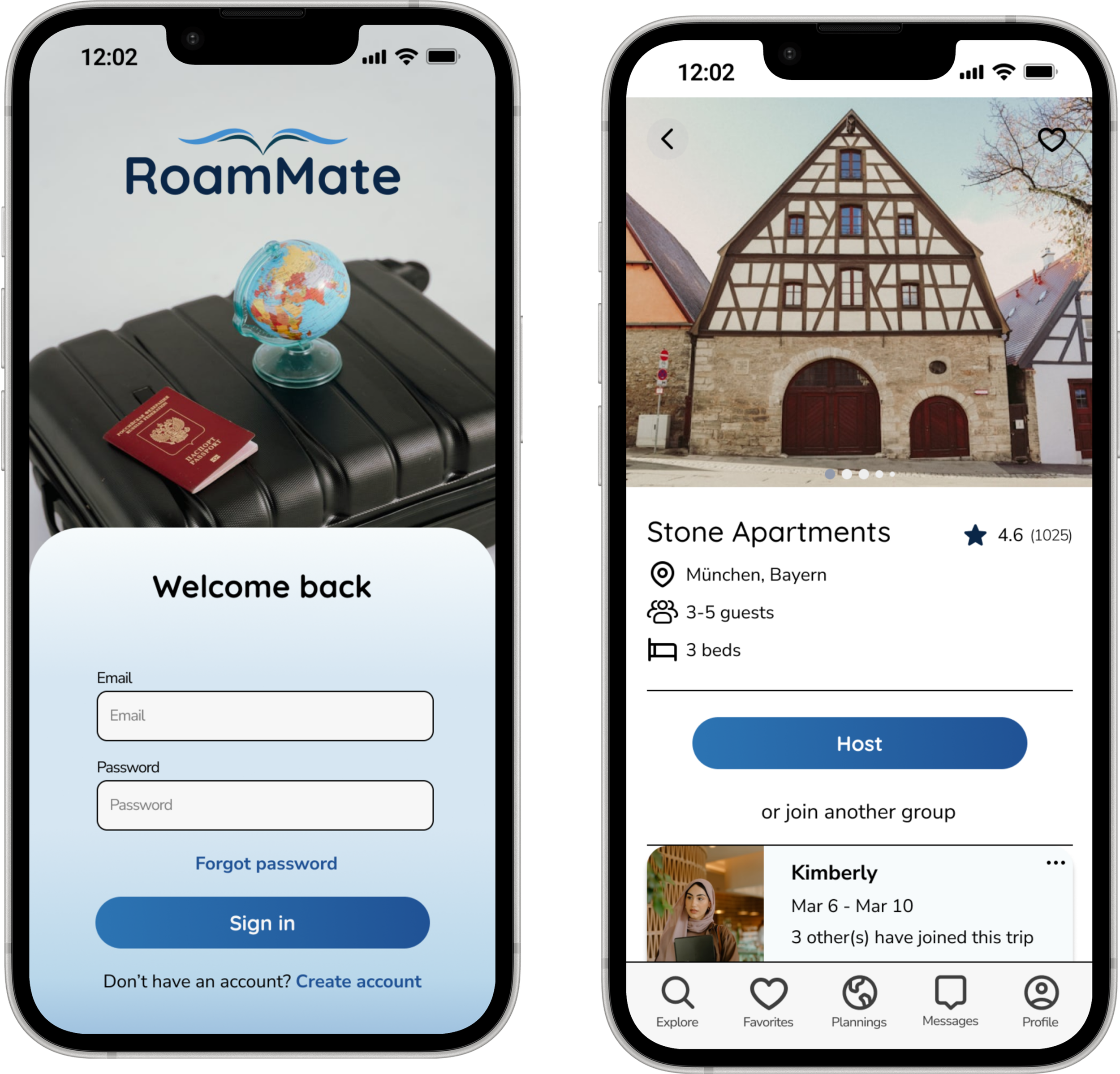
Key screens designed include the full booking flow (sign-up → search → host/join details → payment → confirmation), a Plannings/visited history, Favorites, an in-app messaging system, and rich user profiles showing stamped locations, acting as a trust signal for co-inhabitants.
Design Highlights
→ Guest profiles visible before booking — directly addressing the #1 user frustration
→ "Host" vs. "Join" split — empowering both sides of the co-living dynamic
→ Stamped Locations on user profiles add authenticity and spark conversation
→ Plannings tab keeps future and past trips organized in one place
→ Messaging built directly into the app removes the need for external contact
Mid-Fi Sketches
Component Library
Branding
Mid-Fi Sketches
Lo-Fi Sketches
05
TESTTesting Confirmed What Worked, and What Needed Rethinking
100%
Task completion rate across both test tasks
5
Moderated remote participants all with prior travel experience
This was the second round of usability testing, conducted remotely via recorded video sessions with moderation. Users were given two tasks: booking a stay, and connecting with another traveler. The testing validated that the core flows were intuitive, but surfaced some friction points worth iterating on.
One particularly interesting finding: 4 out of 5 users navigated to the traveler connection through the messaging tab rather than through the Plannings/visited history as designed. This revealed that users are more comfortable reaching profiles through familiar social patterns, chat logs, rather than a booking history view.
"Users would work around the center of the home screen first, showing the visual hierarchy is working as planned."
0
Major errors ~ no user fully lost their way
or restarted
Iterations (Priority Order)
1
Relocate & Redesign Search
Move from bottom to top as a prominent search bar, users consistently noticed it last or not at all.
2
Clarify CTA Copy
Replace "Book" with context-specific labels like "Next" or "Proceed to Payment" to reduce
confusion mid-flow.
3
Expand Filter Options
Add sort-by-price and sort-by-rating inside the filter screen, not just as separate buttons.
4
Add Message Button on Profiles
After connecting with a traveler, surface a direct message CTA to make the next step obvious.
06
CONCLUSIONReflections, Lessons, and What Comes Next
Challenges Faced
Balancing a dual-sided platform (hosts and guests) within a single, coherent flow without overcomplicating either experience
Designing for trust, finding the right amount of profile information to surface without feeling invasive
The "Host" button's visual prominence consistently drew users' attention away from joining flows, requiring careful hierarchy adjustments
Defining a clear end state for the "connect with traveler" task, users weren't sure when they'd succeeded
Next Steps
Finalize all four iterations from the second usability test
Develop a review and rating system for co-inhabitants post-stay
Explore a "Travel Group" feature for users who want to coordinate plans with connections they've made
Design an onboarding preference flow to better match users to compatible co-inhabitants from the start
What I Learned
Users navigate by pattern recognition, designing around familiar social metaphors (chat → profile) is more effective than logical information architecture alone
Visual hierarchy does most of the navigation work; when it's right, users barely need to think
Copy is design, vague CTAs like "Book" created more confusion than any layout issue
Testing early, even informally, is always worth it
What I’d Do Differently
Test the information architecture with a dedicated card sort before committing to the navigation structure
Design the success states for each task earlier in the process, they were an afterthought and showed during testing
Explore the remote work use case more deeply; it felt underserved in the final design relative to how often it came up in interviews
Most proud of
Designing a product that genuinely addresses a real gap in the market, not just a portfolio exercise. The research consistently pointed to a user base that wants to travel alone but doesn't want to feel alone while doing it. RoamMate tries to hold both of those truths at once: giving users autonomy over their travel experience while lowering the barriers to genuine human connection. The 100% task completion rate was validating, but the moments during testing when users spontaneously said "oh, this makes sense" were the real win.